Improve your charts and data visualizations in PowerPoint
Make your presentations stand out with clear, confident chart and data visualisation techniques.
Learn how to use data visualisation to turn complex information into clear, engaging and easy-to-understand presentations that help your audience focus on your key message.


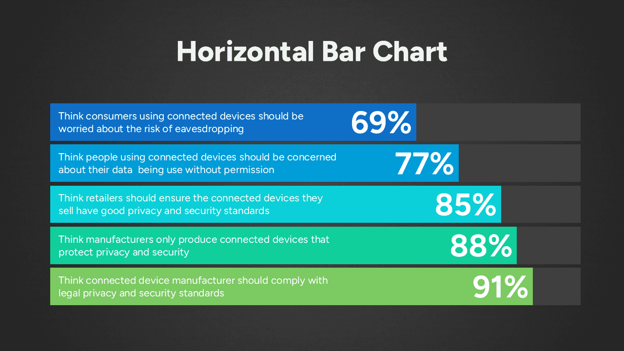
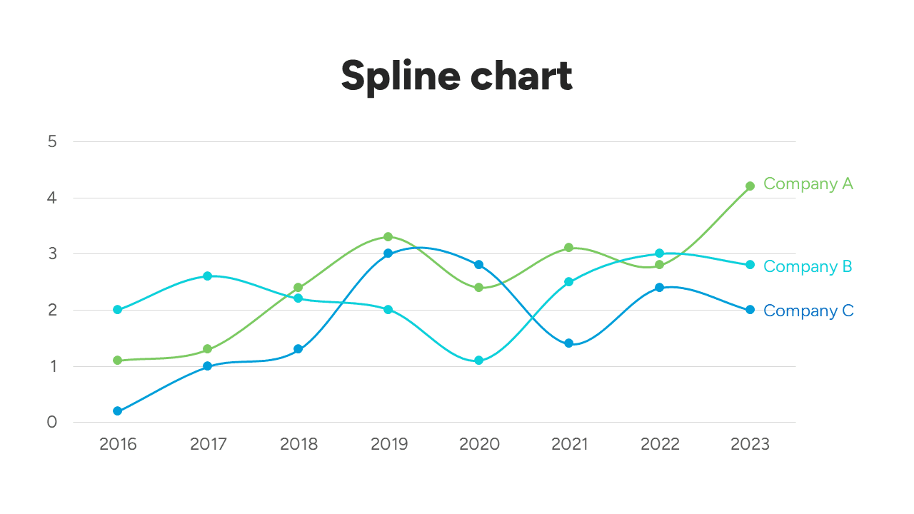
Explore practical techniques for improving bar charts, pie charts, pictorial charts, key data points and proportional area charts, while keeping your data live and editable in PowerPoint.
Through step-by-step examples, learn how simple design changes can make your data stand out, simplify your charts and give you greater creative control over how your information is presented.